Location Photography
Photographing on location can be sometimes difficult, depending on certain aspects like weather, traffic and other things that may distract from doing a good photo shoot. However, if you plan your shoots and use your skills you could capture some beautiful shots. Consider warm clothing if its cold or waterproof clothing if its raining. Some extra equipment may be needed such as a rucksack, tripod, flash, extra lighting if necessary. Here are some typical examples of location photography;
- WEDDINGS
- SCHOOLS / COLLEGE / UNIVERSITIES
- SPORT EVENTS
- TRAVEL / LANDSCAPE
- NIGHTCLUBS / NIGHT OUT
- FAMILY EVENTS
Here is a photograph of a wedding event on location. The photographer must of traveled to this bridge to take this epic photo of their wedding day. The photo seems quiet dull and rainy with the newly weds as the focus, because of the women's white wedding dress that opposes the darkness.
This is a photo of a girl in a field with her best friends, her toys. She is having some sort of tea party and the photographer has chosen to take it from a far to be more discrete and capture the girl more realistically with natural reactions. The exposure is bright with natural lighting. Again this is still on location.
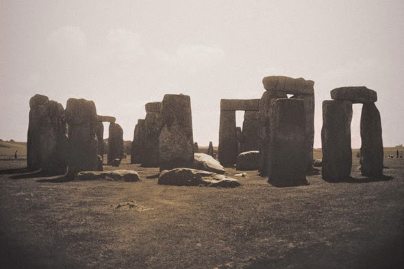
This photograph was taken in Salisbury, Somerset, showing the mythology of England. The stones where placed in a mysterious manner now used as our heritage site. The photographer has taken this shot very boring in my opinion, if I was to do this shot I would bring it to life with all the legends and mysteries of Stonehenge.
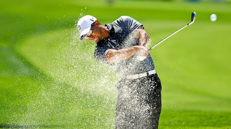
Here we see a golf event which we would call sport photography. The location would be at a club or a special venue where they play for tournaments. The shutter speed must of been quiet fast to take such a high definition shot.
HERE ARE SOME GOOD AREAS IN Birmingham, England TO PHOTOGRAPH AS EXAMPLES:

Barr Beacon for a great view of Birmingham City and also for sky and space photography.
The City Center where busy life can be found everywhere, also great architecture.
Sutton Park for nature, wildlife and lakes.
Some necessary equipment for Location Photograph:
Camera, Camera lenses, Camera strap, Flash, Lighting equipment, Camera bag, Warm/Waterproof clothing, Exposure meter, Shutter release, Reflectors, Water, First Aid kits, Tripod, Diffusers, Notepad, Pen ...
Things to consider when planning a shoot:
WEATHER, TRAFFIC, TRAVEL COSTS, TIME TAKEN TO TRAVEL, FIRST AID, SAFETY, THE LAW
Here are some famous location photographers;
Ansel Adams
Ansel Adams is a famous photographer from the USA. He was born in San Francisco, California. Ansel is a master of his craft in the darkroom, where he use's different techniques of dodging and burning, which I will use as inspiration for when I edit my photographs. Many of his work such as the Yosemite National Park, and the American West have been reproduced numerous amounts of times. He was also an environmentalist. Alongside, Fred Archer, Ansel later developed the Zone System
as a means of knowing the correct exposure to edit the contrast of the
final image. Very often he liked to use a large format camera because its high quality resolution makes sure the images are sharp and decent. Adams discovered and created the group "f/64" alongside his fellow photographers Edward Weson and Van Dyke. He was known as the most famous photographer.
Here are some examples of his work;
Ansel Adams shot this photograph in 1952 with an 8"x10" view camera facing east of the Merced River. The gushing water and the sun's rays we call sun flare, is coming through the darkened
clouds that create a feel of movement in the photograph. The overall image has tones of black & white and grey. The purpose of the image is to portray this beautiful scene of The Merced River. This is a great image and I like how it would be hard to recreate it, from the awkward angle of the shot to the weather forecast. There are also hints of lines in the photo where the trees are pointed into the sky and the background cliff creates a strange sort of shape that makes a layer effect. The image comes across like its broken into three sections; the sky, the nature and the river. I like this image because of how he got a lot of the main points of interest of the location into the photograph. I can see his use of dodging and burning.

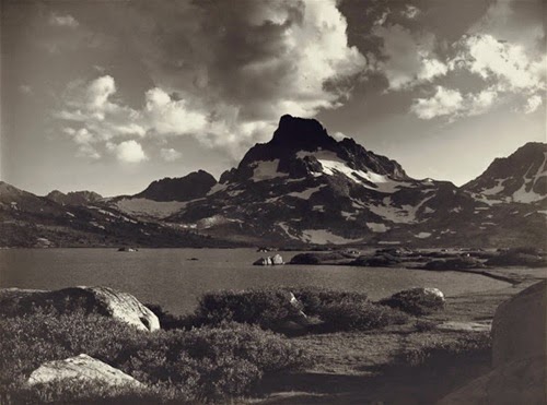
Ansel took this image with an 8"x10” view camera from
the Old Sentinel Bridge. This is a photograph shot of a lake-side location. It is composed up of various elements for example, the use of reflection in the water to make more of a scene and to fill in boring space. The trees have different textures and patterns like lines. The colours are limited and kept to basic tones of black, white and grey. As we know Ansel liked to use dodging and burning techniques so he might of brightened and darkened certain areas of interest, such as the mountain or the lake or trees. If I was to recreate it I would add more space to the image because it looks like he has cropped part of the trees out which I find a shame.


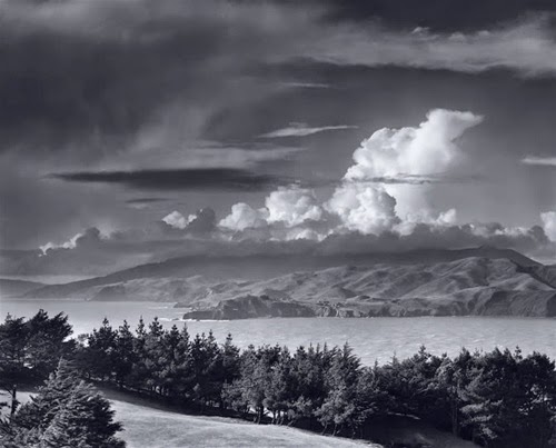
In these four images we can see how much Ansel Adams likes to use clouds in his work, these four examples have inspired me to use clouds in my final set of images. He has been inspirational by the way he has developed his photographs, he is famous for knowing the tricks of dodging and burning so I am now going to use this as inspiration with the clouds in my work.
In the four images we can also see how much of the sky he likes to get into his pictures, maybe to show how vast it can be. It brings light onto the photos from above completely natural, hides light out in certain places and gives it a more soft feel to it from the shapes and tones of the clouds on most of the photographs.
Another thing I notice is the water, he likes to capture lakes, rivers and oceans with other various subjects usually mountains and woodlands. In photo 2 he has shot an image of San Fransisco, The Golden Gate Bridge. Most of this photo is made up of the sky. The photo underneath (photo 3) shows most of the mountains 3/4 of the image. Therefore, we can see how he composes his images, his style.
So this demonstrates that he likes to use what we call SPACE, where he can hide boringness and fill bits in, showing most of the landscape or most of the sky's. I will take this on board in location photography. Out of all 4 images the fourth is my favorite because it looks beautiful and soft, well light and sharp. It's nice to look at and a perfect example of the technique of dodging and burning, shadows and highlights.
I can also see where the lake has been lightened and the trees have used dodging and burning, but to lighten the trees and brightening the pixels to add sharpness and drama. It also has a rule of thirds if you turn your head to the left, we can see the lake is on the rule line and the darkest cloud creates a sort of line too. The thing I don't really like is how the darkest cloud on the left of the photograph is blurred out and smudged in like charcoal, it looks a bit dirty and messy.
 Pete Seaward
For other 30 years Pete has been a professional photographer. He works mainly on promotions and advertising. He has traveled the globe for some of his well known clients. Whether it is in the studio or if it's on location, Pete has the skill, knowledge and experience to make it work. Often, he is working for the Lonely Planet magazine and is working on a big exhibition and book that shows the reality of travel photography featuring
imagery of the world rarely seen.
Here is some of his location photography;

Here is a photograph Pete has taken of New York City. It shows the viewpoint shot from above looking over kind of like a birds eye view but not quiet birds eye, of the busy life of Americans. I suppose this was the intention of the photographer. We can see architecture, various textures, subjects and objects. The photo is taken in black and white and the whole scene seems to look like a pop up children's book, like the way the buildings stand normal and upright, but on a tilt. Also the road we can see stretches far through until the view point is out of range and too far for us to see. We call this the vanishing point, kind of like a horizon. The roads show many people that look like ants and the taxis looks like toy cars. Maybe he got up this high to capture so much more detail and so much more things going on in the scene than if he was say on the floor or on the second floor. I like this image because he went the lengths to get such a good picture, this is why he is a great location photographer.

This photograph is of a beautiful landscape somewhere cold and wild. The frost shows the mood of the image and also the temperature. It looks like there is only one main tone of blueish white frost but with different tones of the natural light from the sun on the trees. The waterfall itself seems to be a slow fall, probably by the way of a slower shutter speed and aperture. It's also running down the center of the image for attention and splits the cliffs. I like this image because its nicely took from a nice angle from above looking over the cliff side into the stream.

This is a great photograph from Pete Seaward showing a Discovery Land Rover off road. It gives me the feeling of adventure. You can see in the main space its all off road high up in the cliffs. Whilst the background is beautifully composed of mountains covered in snow that shows the effort and journey of the driver. The sky is also in view, the clouds are low which also shows how high up the driver is. There are lines in the image on the main mountain in the middle of the photograph we can see the clear divide. The shapes coming from the mountains in the distance appear like little triangles, so therefore there are many geometric shapes in this photograph. The image is clear and has great colours and tones. I like this location image because it gives a great feeling of adventure and makes me feel refreshed. We know the car is defiantly moving by the smoke produced.
Here is some research I used
as inspiration for my locational images:
Here we can see the first process of getting ideas for my work;
Here is my photoshoot plans before heading to the shoots, it is important to plan before heading straight there.
Here are my Final Location Photographs:
This photograph was taken on Lyme Regis beach in Devon, England and I wanted to capture the waves coming in whilst studying the beautiful sunny day but in a different approach. I found a great sized artistic rock that showed shadows and highlights quiet well. I edited the photo black and white, leaving the ocean in colour. I then used Ribbet.com to edit the tint of the sea a beautiful artifical blue to oppose the black and white. I made the image sharper and I got a beautiful HD looking photograph. I was prepared for hot weather, and wave splashes on my camera, I took a cloth, lens cover, digital camera and that was all, I used a wide angle lens but later cropped the image in Ribbet. If I was to change anything I would of liked to capture the top bit of the boulder a little bit more because I feel it looks just cut off. You can also see a hint of lines through the waves forming on the shore.

This was taken in a garden environment on a bright day, this helps to get better quality images using natural exposure. The photo is of a ladybird doing its everyday thing, going from flower to flower. I used a great aperture to capture the ladybird up close, to get a high-quality looking shot. I also set my camera to MACRO FOCUS mode which is much better to zoom than in wide zoom. I wanted the whole image to be natural, no editing or filters, however I did just sharpen the image and used the clarity tool for more definition. The image was taken from above and very close, but I did crop the image to get an even closer look, but I did want the ladybird in the center of the photograph and I like how I managed to get the whole leaf in as well.

This location was a more urban city area, I wanted to capture busy life in a town. I used Birmingham as my photograph because its the second most populated place in the UK and also it is home. In this photograph It was raining and I remember my camera kept getting splashes of raindrops on, so I decided to use it as inspiration because England is always raining, and its typical to rain at a busy time during Christmas. I took the photo from the best viewpoint possible, with the most interesting architecture showing. I later edited my image online and used various tools, such as; blurr (for raindrops and movement of the people,) black and white (for the blank, dull sky that I bet nobody payed attention to that day,) boost (to enhance the visuals like colour and tones of the streets, shops and lights.) Also I cropped, sharpened and wiped out unwanted things. Im happy with this image because everything was great in its place, captured at the right time. The only thing that I would love to change is the bullring bull on the left, I wish it was either facing us or not there altogether, but it does add to the colours, lights and shapes. There are so many shapes in this image that Ive tried to capture such as the bridge over the heads of the public, The straight lines in the buildings, the bendy lines in the buildings, body shapes, blurred movements it all made a great image.

This was a simple photograph that if not explained could be confused. It was taken from a window high up on a bright, hot day. I captured the photograph and liked it because of how it seemed to be above the clouds with the one flying, lost bird. I was also inspired to edit this image by Toy Story, Disney. In the way that when I think of a baby blue sky with puffy white clouds, I think of a childhood cartoon feeling. I edited this image on Picnik.com where I cloned most of the cloud to the bottom to make it look like we are above the clouds. A filter which gave a space texture glow, where we can see the lines and smudge on the right on the image. Also I softened and sharpened where I needed to, and in the end I was happy with my result.

This photograph of the Bullring Bull in Birmingham was taken in the center of the city. It was on location and I needed to time it right before tourists and visitors ruined my concept. I wanted to capture the bull with the surrounding area as empty as possible, whilst the sun was still up and the lights where just turning on. It took a while and a few shots but I managed to empty the picture as much as I could of passer-by. I edited the bull first of all, by brightening his bronze and using the sepia tool quiet often. Also I used eye brightener (which I use to create a sort of bright shiny appearance on my models), then I used blur, colour boost and sharpener. I cropped the picture as tightly as I could to eliminate distracting things. The image is quiet soft as a whole, but I took care in making sure his eyes looked vibrant and sharp, I wanted his emotion in the photograph, his anger, his pride. Also the rule of thirds can be seen by the bulls left eye (to our right) with his body blending into the background I really wanted to show Birminghams famous landmark in his full glory. I like this photograph but the only thing I would of liked to of done is to of took it from a further distance to get the lights in the photo more to avoid squashing.
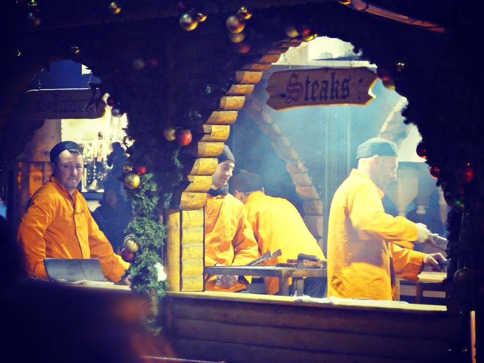
This photograph I took during Christmas time in Birmingham's German Markets. The image contains four men in matching uniforms serving the public to different cuisines. I wanted to take this image more naturally without them actually knowing so its less staged. I took the image from a far to capture the atmosphere in the photograph. We can see the steam from the heat, the rule of three men standing in a sort of upright pattern, whilst the other man is serving. The arches in the wooden cabin act as a frame to capture the Christmas spirit of the busy chiefs. When I later edited this image I cropped into the scene a little more and gave it a brightish, blueish filter which actually worked well with the Christmas theme. The funny thing is the man on the left is looking right towards the viewer so we immediately feel involved with the atmosphere. All I used to capture this photograph was a camera, warm clothing and an editing software.

This photograph is of modern day Stratford-Upon-Avon. It depicts some sort of calender etched into the stone flooring. I wanted to photograph this because It caught my eye and I thought I could bring it to life, the calender is set in a circle shape but the way I've took it makes it look square, elongating in a way.
i edited this photo on ribbet.com, firstly, i converted the picture to black and white then boosted the lines between the stones to stand out also sharpening to make it stand out more in HD quality. I then added a glow filter which made it appear magical, also a little blur to soften.Using the rule of thirds you can see how the calender elongates toward the top of the picture.The photo as well is all in focus therefore the was no depth of field and no aperture. There was no need for shutter speed as there was no movement, however the blur gives effect of a little movement. The exposure is subtle which adds to the effect, as its took in natural light and gives a cold feeling because of the grey scale.

This Image was taken on location at a park in Stratford, I wanted to capture the bird in a center focus view in a way so that the animal would have to stand out. The purpose of the image was to show the appearance of the bird in the water, so people could see his features and being natural. His face was appealing to me because he was a dark coloured bird with a white mask like face and I found this interesting. I shot the image as close as I could, a little above the bird. I got in close for better detail but I kept the bird in the center of the image on purpose to keep the ripples that formed when it swam. The lighting was completely natural and came from the sunlight, we can see it coming in from the top right of the picture. So I didnt need any kind of flash, even though flash does help with quality. I planned to edit the picture later on Ribbet.com because I knew I could develop it nicely. I boosted the colours of the picture first, then I blurred around the image to create the soft waves. Then I applied a reddish orange filter for the water because I thought it made the image look richer and different. Also I sharpened the image to still keep the ripples in the water visible. There wasnt really much use of aperture and as for shutter speed I kept it around 1/125.

This photograph was taken in a museum therefore it was on location. The image I have created was a statue of some amour. I noticed that there was a lot of natural lighting coming from a window of a corridor on the right of the subject. I wanted to trick the viewer into believing it might of been took in a studio environment. I achieved this by blurring out an elevator on the left in the dark, and blurring the natural light on the right to look like a sort of studio blurred lighting sort of effect. The actual subject I positioned a little to the right of the photograph to add a little space to it and to knock it of focus a little for interest. The texture of the subject appears to be hard and metallic, I added shine later in Ribbet to
make parts of the armor stand out a little more for better texture and visuals. There wasn't really any depth of field because it was just a straight blur in the background after editing the subject. My intention was to prove that location can be disguised using skills and techniques.

This photograph was also on location at a museum, I liked the look of the mannequin in the Chinese robes. I thought it had some mystery to its face so I used this as an idea. I took the image from close but of a full body view, I took the shot with its body sort of on an angle to add the feeling that he is sort of turning or moving. I liked where he was situated so I left the scenery in. Then when it came to edit it I first used a black and white effect which I had in my mind when I first took the image. I then softened and blurred out his face to exaggerate the mysterious vibe surrounding him. I liked how the floors shined and the windows shone so much light, with this darkened figure adding mystery. I later sharpened my image to get the best crisp effect I could. The figure is also standing in a rule of thirds where the whole figure acts as a line in the rule of thirds. The exposure is natural lighting coming from the sunlight outside. I wanted to show shadows, highlights, black and white, mystery, use of light all on a simple image and I think I achieved this and I was happy with the result.

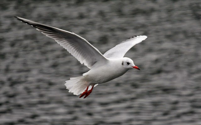
My photograph of this bird was great to capture. It was taken in Sutton Park, which I really recommend for nature and wildlife. Therefore, the image was in a outdoor location where natural lighting helped. I wanted to capture a beautiful bird airborne showing its wings spread and full body in flight. It didn't even take me much time or shots, like sometimes in photography when you re-take to find the best image. However, I didn't need to plan this one because it was a natural shot. What I did to achieve this image was to sneak up on a sitting bird, perched on a pole by a lake. I got ready by adjusting my settings on my camera to a quickish shutter speed and a matching aperture. I wanted light to enter the camera for quality of the photo. Also I wanted to keep in mind to leave a little bit of space in the frame of the picture to show movement when I finialise my image. In stead of using rule of thirds I chose to focus more on space in the photo. I didn't want the bird to be captured coming to land on the water so I kept the spacing to the left of the image which normally I would of put to the right but then it would of looked like he was about to land. But I wanted to capture the swooping of the bird. I edited the image adding sharpness, more vivid colours and softening the water. The only improvement I would of liked was to get more of his face in or brighten it a little more.

This image of a bird was in fact the photograph before the last photo. This was taken before the bird took flight. I wanted to capture the bird resting but keeping an eye on everything. First thing we can notice is the birds eye catches onto the rule of thirds, which attracts us straight away, this is why the rule of thirds is a great technique to use that are called eye leaders. Also I chose to shoot my bird in the center of the image, covering most of the photo, yet leaving in some background but not quiet in focus. This is where Aperture comes in. I used a large aperture to achieve a shallow depth of field (the smaller the number the larger the depth of focus.) I also later softened the background when I edited it on Ribbet, which helped blur the background more softer than just blurring it all. I also smart sharpened the bird and added a filter that was called Cairo which gave it a really weak blueish light effect. The speed of the shutter wasn't important but it had to match with the aperture, but because I used the Aperture setting on my camera, it automatically set the shutter for me. The texture I wanted to show was soft, but of a soft bird close up so I edited the feathers with a soften tool that allowed me to do so without too much darkening because this was important to keep light so we can see the detail of the birds feathers and body. The view was basically took from eye view point and I had to sneak up on it and take multiple pictures approaching the bird for a better chance of getting the shot I wanted. The lighting was all natural coming from the sunlight on a pleasant day. I didn't need to use any kind of flash because the natural exposure was perfect.

This landscape / animal photograph was when I visited Nottingham for some location photography. I had to plan what I wanted to take on the day of going to shoot. I took warm clothing, my camera, wellies and just a cloth for dirt. What I did was I visited a stable of a friend and planned to do a photoshoot of the horses. I found two great matching horses that I thought I could photograph well together. I took the image from about 5 meters away at eye point and cropped later in Picnik. I knew that they where mother (on the left) and son (on the right) so I waited till the horses where in a good position till I took the photograph. I thought at this point the horses where ready and perfect so I shot the photograph keeping in mind the background. Most of the beauty was natural but the photograph was heavily edited in my opinion. I edited it on Picnik an app that allowed me to add a vintage filter, adjust shadows and highlights with the dodging and burning tool. We can see underneath the horses I have used the burning technique to darken them specific region underneath the horses. I wanted the vibe of the picture to come across as a cold British farm place. The filter helped because it helped to frame the photo in a vignette effect and so did the burn tool. Also cropping, sharpening, boosting colours, blurring bits and sharpening the tree above the mother horse's head. We can see layers in this picture by the means of the hills in the background, the horses as a main focus, and the space of the sky. I managed to get like a movement effect by how the one horse has lowered his head and the other keeping hers raised. This looks like I have somehow captured the same horse in a different stance and cropped it onto this photo. So it gave a good effect because in fact they where different horses just in different stances. Various shapes and textures can be seen within this image, from the horses neck that is light up by dodging, to their legs, to the trees in the background. There also can be curvy lines seen on the edge of the hills. This creates a scenery kind of landscape image within the photo and also can lead the viewers eyes to certain places. I used them in this case to represent the vanishing point of the trees, that leads to the sky.

My last image was in a museum, a photograph with not much logic to it but more artistic themes, we can use visual language to analyse . I took this image without any planning or consideration. I shot it from a low level vantage point looking underneath some art boards in the museum. The photo contains a few themes that I was hinting at, but the main two were the lines and legs. The lines in this photograph can be seen all over the place, from the cropping tools I have used have created even more thick layers of lines such as at the bottom of the image we can see the flooring. The brown coloured lines of the art boards, the lines of the wood holding up the boards, the legs are appear to be upright lines, the chair in the distance contains vertical lines, there are also many horizontal lines too. Lines in photography are used to direct the eye to certain points of interest but here I wanted to use line after line to confuse the eye, but horizontal lines to oppose the vertical lines in the image resulting in framing "the legs." The legs of the men in the image can be seen from two points of gesture. From face on to the man facing to the side. Legs also can be seen in animation on the left of the image on a board at the museum, this is what actually was my inspiration for getting on the floor and thinking of the idea. The composition of this photograph is quiet tight, with a lot of framing and tones of warm colours; yellows, golds, reds, browns. The depth of field is wide and quiet sharp throughout the picture. The focus is sharp, I used clarity to make things more bolder. You can see in the mans legs facing us, that they stand out quiet sharp and high quality, you could say this is the center point of interest because it's framed by the lines and appears in a boarder just like the animated museum version on the left. The lighting is quiet bright really, It was artificial because I used the lighting that was in the room at the time. I did not use a flash to keep the tones of the room warm, but did brighten the image later when I came to edit it. The colour is quiet high saturated and I used the Boost colour tool in Picnik to strengthen the tones of the picture. These colours remind me of wood and since there was a lot of wood in the art room I thought I would stick to these tones.
Reviewing my photographs

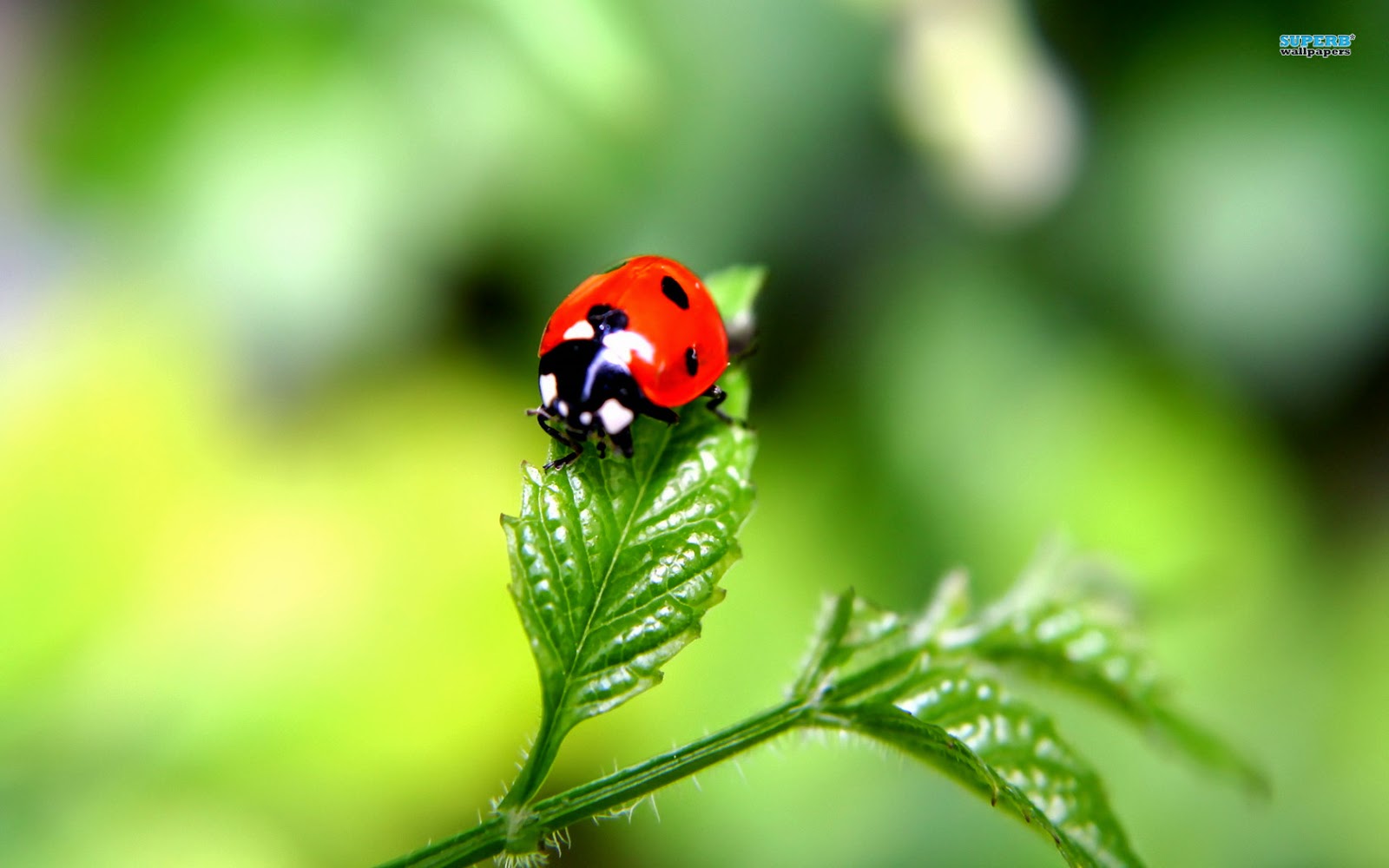
This photograph I took of a lady bird I feel did myself proud. I was inspired by this image on the right. I planned to copy its style of aperture and the way the lady bird is on a leaf. In my opinion my photograph was better because there is a lot more background in view and less blurred than the other photograph this shows more atmosphere and use of space. It shows the location and the habitat a little better than the other image. I did get some feedback of people and one girl said she liked the other image better because their ladybird was more on a leaf, whereas my photograph looked like the ladybird was more on a cabbage kind of leaf she said. In a way I agree but I still think that there is more detail on my leaf by the ways of the little hairs that can be seen. Also it looks like you can see the mouth open on my ladybird photograph, whereas the other image there isn't much detail to it at all. I love the positioning of the ladybird, the way its also in center focus, the sharpness and blurriness comparison Ive used. What I would change about the photograph is not much to be honest, just maybe a little cropping for a better centered subject. If I was to retake it I would of shot it on a more beautiful looking leaf. The image that inspired me worked in my opinion, I'm happy with this final image.

These photographs I will analyse together because they were from the same shoot. First of all what I like about Image 1 is that the bird is positioned perfectly, I wouldn't want it any other way. I like the filter and the sharpness and attention to detail. In the second image I like how I've captured the bird swooping off just as nicely as shooting it still. I like how image 2 was so close to my inspired photo (underneath image 2). I like how I used their image to help me shoot my shot. I planned my photoshoot carefully and seen things that I could improve when I shot my photographs. I like how I left space in but some people would have had the space to the right of the bird in Image 2, however I think it would

just give the feeling that the bird was about to land, which I didnt want. I wanted to capture it airborne and I think I did so beautifully. If I was to change anything in Image 1 I would maybe edit out the bird droppings on the post, because it doesn't make the image look as attractive as I would of liked. Also on Image 2 I would of liked to capture the face at a different angle because I feel like we cant see the face as well as I hoped. Apart from these weaknesses I am quiet happy with the final images of the birds. I have stuck to my photoshoot plans and I can see what I would of liked to of done differently. I used my research and studied some bird photograph to help develop my own images and how the bird should be seen. These images helped a lot:
I used the wings editing technique of this photograph as inspiration for my own image.
This image I used the background, the birds
beak and feet as inspiration for my own.
I also took these images of birds to practice photographing them a little better, however these did not make it to my final photographs:

This photograph was of a bird in black and white
I captured it in center view, quiet a basic photo really.

This photograph was of a bird in the lake. I captured it in the center of the image and found it fascinating because of its black cape and white mask features. I love the soft ripples that formed in the water, they create movement and softness. I edited them in Picnik adding a soft filter and sharpening also. The only thing I'm not so keen on in this image is the right side of the photograph where you can see the soft effect much more than the left side. I should of sharpened it a little better and not used the soft brush as harshly.
This image of the sky I shot turned out nicely. I think I achieved the TOY STORY movie theme that I wanted. I have had many positive feedback, some people asking me how did I get so high up in the sky because It looks like I've taken it in the clouds somehow. So in a way the photograph taken certainly confused unprofessional photographers and people. I like how the shape of the cloud is myself, white and puffy just like cotton wool. I love how there was the one perfect bird in the sky that I wanted to capture. I like how the lighting, flash and editing programe has helped me to achieve such a bright, quality looking image. The only things I would of liked to improve was the way I cloned the image. If you focus on the center of the image on the cloud we can sort of see where I have cloned the clouds down the photograph a little. Its not that noticeable but I would of liked to have been more discrete. There isn't much more I would change for my first ever sky photograph.

In this image I originally planned to photograph two white horses that I found research of on Google. The images are underneath my photograph.
In my image I like how I managed to achieve a sort of symmetrical look with the horses. They seem to be the same horse yet edited because of the heavy editing of the photograph. However, they were mother and son and I wanted to get the one horse to bow their heads to match the images I found online. I managed to do this so it was a great success as a planned location photo shoot. The things I like about my final image was how I used the burning tool to darken parts of the horse that Ansel Adams inspired me to use. Also the tree in the background that stands out quiet nicely from the rest. The filter was a nice effect to maybe I could of not had it so heavy around the sky because I'm not to found of the vignette effect It gave, I was more into the vintage gritty look it give my image. The girl who's horses they were was impressed with the final image of the photograph so I was proud that It came out so successful in making her happy. That as my intention of taking the photograph. I also learned in this image to really plan my shoot and stick to what I should of brought with me, because I forgot my wellies the mud was really annoying on the day. Here is the images that inspired me to take my image;

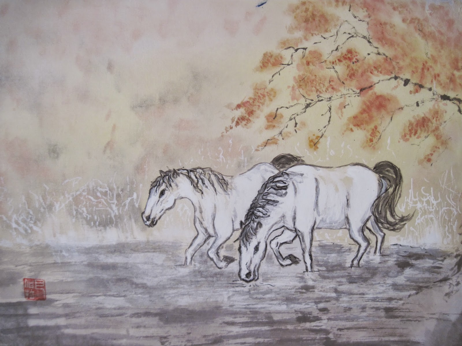
In my opinion the first image is a good example of my thought process. It shows the rough weather forecast I was going for yet my image had much better scenery and layers. However I feel comparing their detail of the actual horses with my photo I think their sharpness and exposure was better.
This image I designed using various art equipment a scene in which I will try to capture in real life. Even though I didn't use the water idea, I recreated it to be grass where the horse is eating instead of drinking. I also kept the tree but used it as a single sharp tree in the background of my hill.
The photograph of the Bull in the Bullring turned out quiet well. There are a number of things I like within this photograph. Firstly, I love the colours, tones and bloom or reflections in the photograph. It sort of has an overall soft exposure, with the lights being artificial yet using some natural lighting from the outdoor setting. The background turned out so good. I love how the soft reflections can be seen in the shops behind and how the floor in the image seems wet and you can see how slippy it is to reflect the weather. I managed to achieve this without no real hints of weather, by using the floor. However, I'm not so keen in underneath the bull because the rain didn't give that nice effect so I didnt edit as good there either. I'm happy with the background because it contains no real person which is really hard to do at Christmas time in the Bull Ring.
If I was to retake the image I would like to get a back a little bit more to make the bull seem even bigger and prouder than I got. I love the eyes and the sharpening and boosting the eyes really did help draw the viewer in. I love how I managed to get the eyes on a rule of third, whilst keeping the body in tight with the frame and capturing no people all at the same time. I had no tripod so it was annoying, I will remember this next time. The lights in the floor do somewhat draws eyes there too which isn't what I wanted really, because they are a little distracting. I would love to use this as promotion for Birmingham in some way.

This photograph was somewhat annoying to take because of the amount of people walking past, the right moment till the staff are in position, the way the steam didn't show. These are the many problems I faced in this image. Another would be the quality because I was so far away to keep it wide and natural, the zoom made my quality of the image not as good as I wanted. I managed to hide this by a filter that matched the Christmas market theme. I applied it from Ribbet.com and it works so well. Next time I would take it with more lighting maybe a flashgun because my camera flash attracted orbs and noise. The strengths of the photograph however can be seen by the way the arch frames the scene, the filter and decorations set the theme. I love how I captured the staff working as a team all doing different body language and in a rule of three. Also the way the one staff is looking my way, towards the viewer it makes us feel involved with Christmas spirit. If I was to re-do something simple that would be the man on the right, his face I would like to of maybe sharpened or brightened because the smoke has somewhat dimmed or blurred his face. For an unplanned location photograph I was happy with this final result.

This photograph is kind of like Marmite for me in the way that I like it and I hate it. I love the city life in the bottom half of the image but the top half Is the part I hate. I don't like certain points that I will circle in yellow on the next image.
I love the tones, textures of the wet floor, the shapes of the bridge, architecture, sculpture of the bull and the general busyness of the shopping center in the rain. I wanted to show the sky somewhat unimportant in the photograph, like blatenly gone. I planned to do this by using black and white for the sky that reminds me of rain and boringness because people don't really stop and look around during the busy season of Christmas escpially in the pouring rain. I like the image but the only let down I feel is the sky. This photograph shows the errors I would of liked to change, and could probably still change:

Here we can see the exposure colours are just pouring out of the architecture which i didn't want. I wanted the sky to be full on black and white with no light coming onto the sky, because It looks edited and false. A trained eye would notice this and that's what the weakness of the image is. I could probably help this by going onto an edit app and selecting the sky to be black and white while the bottom layer in colour. Or by painting the sky in black and white over the exposing light.
This image inspired me to create my image with a sort of glow or bloom to it. However I made my blur effect from rain and the blur effect, this image uses perfect glowing architecture and nicely touched work. I think this shot is perfect.
This photo is of the future plans for Birmingham.
I also took this image of some stairs that was taken in
Footasylum as a shop location but later I thought it was
to heavily edited and it looked to cartoonish to use. It was of two sets of electronic stairs that where green in colour that represented the futuristic earth that people will soon live in and when they die shall they ascend to heaven or descend to hell. This was my interpretation of the religious views of the people of the city of Birmingham that roam in the busy streets and shopping centers.

This unplanned photograph was by chance. I shot it in Stafford-Upon-Avon where the Shakespeare myths and plays inspired me to take this shot with a twist. I thought I would instead get to a low vantage point and point the camera to the end of the calender. I used the rule of thirds grid to line up the calender as I took it so it was all perfect. I didn't use rule of thirds but It can be seen. I like how my image still gets the message across about what the purpose is instead of the whole big circle on the floor which wasn't needed. The line in the middle acts as a line to draw our eyes up the ladder, also the noticeable rule of thirds help to do this. I wouldn't change much else in this photograph. These images helped to inspire me as I studied mythology and how to capture it better:
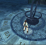
Taken from the Aztec beliefs and the Tomb Raider games.

This image turned out so nice like it's from a film set or something. It was of a Chinese mannequin that I wanted to give mystery to. I think achieved this well by using the soften tool and blur for his face, also using burning helped to darken it. I do think however in the final stage the face still seems somewhat plastic foam looking and I didn't want this. I wanted it to be more mysterious and dark, yet keeping his nose so we know where he's looking. I wanted to make it look like the window behind him was somewhat to blame for his darkened mysterious face. But I don't think this showed as well in the final images as I would of hoped. The costume and textures and lines are all perfect, all down to the body language, exposure and the black and white all looked great. Next time I would edit the light around him to appear sort of sun flare like to hide his mysterious face a little more. This turned out great and because a few people have commented well of it.

My photograph of the suit of amour turned out good. I like how it comes across like its in some sort of studio when in fact it was in a cold corridor somewhere in a museum. I like the tones of black,white and grey, the shiny metallic look on the armor itself. There are some weaknesses though that I can see. If I was to retake I would of took it a further back because even though I shot many photos of this amour this is the only shot close enough to what I wanted but I would of liked to captured more of the head gear in the picture. I had to crop the image also resulting in a little loss of the head gear. Another continuity error was the statues right foot is sort of bent and I don't think It makes the amour look very realistic now or not as strong at least. Someone also commented on the foot so therefore I would definitely of changed it, however we wasn't allowed to touch the actual subject because of museum rules.
Also I wish the sword was actually seen because it looks like its glowing white, this is because it's over-exposed and edited a little careless.
The beach photograph was fun to take because it was all day sunshine which gave me great exposure to work with. It can be seen on most of the image yet the shadows can also be seen quiet strong in the main boulder. This image I wanted to capture a main stone or boulder and use it as an art sculpture to work on. I knew I was going to edit the sea with a strong tint of blue, however I feel the tint came out to strong against the black and white bottom layer of the photo. Also some places where I have touched up we can see tint that has poured onto the black and white in places such as here:

Also the large boulder that I darkened seems to be a quiet obvious when you study it. I don't like this and I think ruins the final look. We can see in this image how the tint spills over and how I can now see what I need to improve on in editing. If I wanted to fix it in the future I would re-edit the black and white onto the extra tinted areas and visa-versa. Also I would of liked to got more of the rock in on the tip of the boulder it has been cropped of this wasn't noticed untill I reviewed my image that I thought kind of let it down a bit. The photo is in a rule of thirds still though but It would of been stronger if I used the grid setting on my digital camera. Next time I could also try a slower shutter to make the sea seem softer and in a slower motion that would of made the photograph more beautiful.

My final image with the straight lines theme was ideal. It had so many frames, lines and repetition to work with, it was great. I liked the image as a whole and can't find any weaknesses or dislikes. I like how the center point shows legs, that are really sharp with great clarity. They match the animated legs on the left, in the museum that gave me the idea of getting low to get a low vantage point and photograph people viewing art whilst being a part of art themselves. This was pretty much the purpose of the photograph.
Another image that didnt make it from the museum was this image;
This photograph I took was of a room that I felt relaxed in that was the intention of the photograph but I later thought that not other people might feel this way. I chose a bland relaxed warm filter that I felt worked well with the theme, it was Sepia. I then shot it threw a mirror that showed a modernised clock on the mirror, reflecting a rich looking hall. The shot was taken with a rule of thirds in mind, in the way that the mirror split into three parts, however later I felt it was kind off-balanced and I even had to crop and rotate the picture to achieve it. I did want to keep the portrait down the other side of the room straight, lining with the windows that brought in light and the lampshades as shapes. It could be used for a magazine or promotion of the bar room I was in when I shot it.
However, I longer did not feel it was necessary to use this photograph.


